Home Refresh
You know what you like when you see it, right?
Your friends’ homes all seem so “pulled together” and you want that too.
Following is a home where my clients said just those things. They had chosen red as an accent years ago because it was easy to find and easy to match which took the intimidation out of design decisions. We quickly determined that they were truly drawn to more soothing tones and colors. They had great style stuck below the surface of a stale design direction!
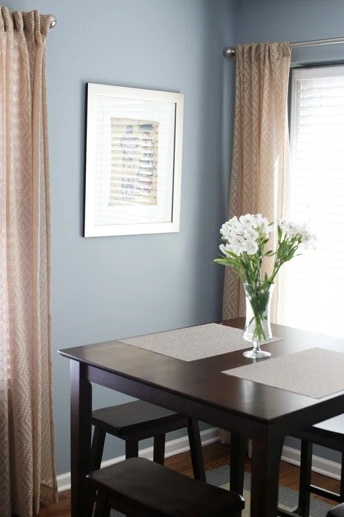
Before and After: Updated paint colors and design elements as well as installed hardwood floors and recessed lighting throughout the first floor.
Painted “frame” on the wall behind the artwork in a complimentary paint color.
Before and After: Hardwood continued into this space from the main area, painted the cabinets and walls, chose countertop, spec’d counter depth fridge, changed lighting and decorative elements.
Before and After: the other side of the kitchen space
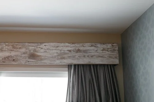
Before and After: Hardwood continues, stenciled accent wall, chose lighting, commissioned a custom art wood valance above the glass doors and changed decorative elements.


